


The Baltimore iconic sigh neon. Inner Harbor. Domino Sugars Company

Tio Pepe. An Spanish iconic sign. Madrid
In the main square of my hometown, in Vic (Barcelona, Catalonia), there was a neon that I saw from the balcony of my home. The word Bellmunt was drawn in a pinkish tone and corresponded to the name of a hairdressing salon located under the arcades. In a city where there was little color, that small burst of light that at night emerged under the fog, usual in those years, impressed me. Also, I was attracted by neon light when I saw it in American movies or in advertisements in Barcelona. I put music to neon light during my adolescence (1970s) when I was hooked on Simon & Garfunfel (I still am). One of the songs of the duo, The Sound of Silence, the best lyrics ever written about isolation, a gorgeous and sad song; in one verse they sing:
When my eyes were stabbed by the flash of a neon light/That splits the night/ And touched the sound of silence.
This verse identified me with Paul Simon: seeing a neon flash at night could be like a stab, I felt a strong attraction to the lyrics, to the music and to the tonal quality. This verse has always been with me. Simon is referring to New York where he lived and where the neon was and is omnipresent. In the United States, where I have been living for some years, I have happily rediscovered neon light, now no longer in the fiction of a movie or a song, but in the daily life. Neon is present in the small towns “main street” and, of course, in big cities. Everywhere.

The word neon comes from Greek and means “new”. From the beginning of the last century, neon was closely linked to advertising and was not seen as an artistic medium. Contemporary art incorporated it as an artistic medium since the 1960s by some conceptual artists such as Bruce Nauman, Joseph Kosuth, Mario Mertz, Lucio Fontana, or Tracey Emin, among others. They use in a both terrifying and fascinating way.

What neon is?
We identify neon with a luminous glass tube that draws letters or a figuration, sometimes animated. Actually, neon is a gas. Is one of the rare or noble gases. Neon and argon are the principal gases used in luminous-tube production. The color produced by neon is orange-red; it is known also as “clear red” when seen through clear glass. The rare or noble gases are chemically inert and will not combine with other substances. They include neon, argon, helium, xenon (it produces a bright blue glow) and krypton. They are ideal for luminous tubing because the voltage they require per foot of glass is much less that the needed for more common gases like nitrogen or carbon dioxide.
One of the curios aspects of the craft of neon is that the essential manufacturing technology has remained as it was when developed by French engineer Georges Claude (1870-1960) in 1912 in Paris. Each part of the process is manual, and it is a handcraft that by its nature resist mechanization and standardization.

Bruce Nauman. Double Poke in the Eye (1985). Princeton University Art Museum
Rudi Stern describe us the technique: “The electrical principle of luminous tubing is directly related to that of lighting. Both are electrical discharges in gas. In the case of luminous tubing, the discharge (and resultant illumination) is caused by a rare gas. Lighting it is caused by air. A lighting discharge takes place in normal atmospheric pressure. The two principal rare gases used in luminous tubing are neon (producing an orange-red color) and argon (blue). The illumination which is produced consumes very little power and gives off little heat while providing a continuous and steady glow. Unlike fluorescent, there is no warm-up time necessary. Gas in the vacuum tube is composed of millions of molecules. In order to initiate a gaseous discharge and produce light, these molecules have to be broken into electrical opposites- negative electrons and positive ions. They do a dance together. In terms of cold cathode or neon lighting this choreography is known as ionization. The high voltage of a transformer produces many billions of pairs of electrons and ions per second. These, because of their mutual attraction quickly fall together again and in the process give off light. Transformers with secondary voltages of from 2,000 to 15,000 volts sustain this continual state of motion and illumination. The dance is kinetic in its composition and structure. The visual vitality of this medium has a lot to do with the kinetic principles of technology.”

To begin a neon construction, a full size sketch is first transferred to a asbestos sheet which can withstand the heat of the molten glass. One of the key of the process is glass bending. According to Rudi Stern, to bend a simple circle might require the knowledge and skill. Learning the moment when the glass it is almost liquefied and ready to bend takes many years of practice. A bender never wears gloves, because is very important to sense the heat building up in the glass. By feel, the bender knows just how long to heat the tubing and when to make his bend before the glass finally solidifies. Once a bend is made it cannot be corrected or redone.
Neon’s History
The neon’s antecedents are obviously linked to the invention of electricity. The outdoor electric-light, which would transform city centers all over the world into nighttime wonderlands of kinetic excitement, was born in the Chicago Columbian Exposition of 1893. Thomas Alva Edison had made this possible through his invention in 1879 of the first commercially practical incandescent lamp. By the early 1880’s he had developed all the equipment and techniques for a complete electrical distribution system.
Neon was first a scientific process and creation. Rudi Stern explains that its history really began in 1683 when Otto von Guericke, of Magdeburg, obtained light from the discharge of a static-electricity device. Twenty-six years later English scientist Francis Hawksbee, known for his work on electricity and electrostatic repulsion, described how he had produced light by shaking up a vacuum tube filled with mercury. A similar experiment was conducted in 1744 by Johan Heinrich Winkler, a professor of physics of Leipzig, who also heat-bent a tube to form a name.
The first prototype of the modern luminous tube did not appear until over a hundred years later. In 1856 the German glassblower and physic Heinrich Geissler experimented with a sealed low-pressure tube in with he produced light using a high-voltage alternating current. So, in the 19th century there were numerous attempts to apply the principle of electric discharge to everyday illumination and with different kind of tubes. The procedure of examining the colors of the light emitted from gas-discharge (or “Geissler” tubes) was well-known at the time, since the colors of light (the “spectral lines”) emitted by a gas discharge tube are, essentially, fingerprints that identify the gases inside.
Neon as we know now was discovered in 1898 by the British scientists William Ramsay and Morris W. Travers. They had succeeded in obtaining pure neon from the atmosphere, they explored its properties using an electric gas-discharge tube that was similar to the tubes used today for neon signs. Later Travers described: “The blaze of crimson light from the tube told its own story and was a sight to dwell upon and never forget.”

Georges Claude with a neon lamp. 1912
However, neon light was first developed in France. Inspired by Geissler tubes and by the American electronic engineer Daniel McFarlan Moore’s invention of a nitrogen-based light (the “Moore tube”), the aforementioned Georges Claude, developed a neon tube lighting to exploit the neon that was produced as a byproduct of his air liquefaction business called “Air Liquide”
Rudi Stern wrote: “When Claude began his experiments, his aim was cheap high-quality method of producing oxygen, then much in demand by hospitals and for oxyacetylene welding. In the process, however, he found himself with sizable quantities of leftover rare gases. Searching for a way to utilize these products, he came across the Moore tube. By filling such tubes with neon and bombarding them with electricity he achieved a clear intense red; with argon he produced a grayish blue. Then he found that by coating the interior surface of the glass he could increase the range of his basic colors.” Claude saw neon lamps as a source of general indoor and outdoor illumination, superior to the incandescent bulb. He create a firm so-called Claude Neon and it was Claude associate, Jacques Fonseque, who recognized the potential of neon for advertising and thus determined the course of the medium’s use for the next years.
In 1910 Claude drew considerable attention by exhibiting at the Grand Palais in Paris, at the Paris Motor Show, a two 12-metre (39 ft) long bright red neon tubes that lit a peristyle. In 1912 Fonseque sold the world’s first neon advertising sign to a small barber shop called Palais Coiffeur on the Boulevard Montmartre. A year later a more spectacular neon advertising, the first installed on a roof, lit up the Paris sky with three-and-a-half-foot white letters spelling CINZANO. The main entrance of the Paris Opera was illuminated with a Claude Neon light in 1919. The colors were orange-red and blue tubing to create an effect that came to be known as coleur opera. In an advertising brochure of Claude Neon, firm that held a virtual monopoly on neon tube manufacture in its early years, neon light tubes were described as “the latest and most artistic forms of electrical advertising and illumination. The light given is continuous, very distinctive, and peculiarly attractive. It has been described as a living flame”.
Neon came to the United Estates
It was with the opera color combination that neon was first seen in the United States. Neon came to America when in 1923 an American Packard car dealer from Los Angeles, named Earle C. Anthony, visited Paris. He met Fonseque and bought two signs from the Claude Neon factory. So, the neon came to California in the form of two identical blue signs that bordered the word PACKARD written in orange neon letters that were placed in a Los Angeles highway. Drivers amazed by something they had never seen as the flash of the neon words that illuminated the night, they stopped to contemplate it. The police was upset: the neon was causing a traffic jam. As of 1974 the sign was still functioning.

I could not find a picture of the original sign placed in a Los Angeles highway but it was like this one, or similar.
According to Rudi Stern, “Americans immediately took the vibrant image of themselves that the elegant French imported medium suggested. Neon soon became symbolic of American energy and inventiveness, giving rise to a spectacular flowering of American showmanship in the late 1920’s and early 1930’s. In the United States neon is part of the visual conciousness and memory bank.”
Claude Neon had the patent and in 1924 he began offering territorial licenses outside France. They were bought throughout the world but nowhere in such numbers as US: there were licenses in NY, Chicago, LA, San Francisco, Detroit, Pittsburgh and Boston. Each agreed to pay $100,000 plus royalties for their franchises. Soon there were 2,000 neon plants cross-country and about 5,000 glass benders. From the beginning there were problems with infringements. As the popularity of neon spread, small one man shops proliferated. Still, Claude’s monopoly held up well throughout the decade. In 1927, out of a total of 750 neon signs in NY City, 611 had been made by Claude Neon Lights, Inc.

Neon signs in the Museum of Neon Art. Glendale, California
It was not the Great Depression that ultimately brought down Georges Claude’s empire but the expiration of the patents and bootleg neon sign-makers had proliferated. Raiding and spying on competitors became commonplace and secrecies and paranoia characterized the electric- sigh industry.
In France neon has been traditionally limited to café signage, café ceiling decoration and movie theaters. Animation is virtually unknown, very little figurative imagery developed. The firm Claude Neon, went through various companies and proved to be unprofitable, so it was closed in 1977. Georges Claude ended badly. He was an active collaborator with the Germans occupiers of France during the World War II for which he was imprisoned in 1945 and stripped of his honors.

Times Square, 1954. New York
In United States, the 1930’s were years of great creativity for neon, a period when many design and animation techniques were developed. For example, Douglas Leigh, lighting designer and a pioneer in signage and outdoor advertising, took neon advertising further than Georges Claude. He conceived and created the archetypal Times Square spectacular. Much of the visual excitement of Times Square in the 1930’s was a result of Leigh’s inventive as a kinetic and luminal artist. One of the reasons why neon flourished in America more than anywhere else was that its electric power utilities had produced a surplus of energy and neon was a new way of consuming it- and so the power companies promoted it.


Frankling Theatre Art Deco. Nashville, Tenessee (1937). Closed in 2006
In the 1930’s on the exteriors of American Theater marquees and movie palaces neon did come into its glory, the neon lights that announced the shows were an invitation to a glowing and spectacular event. One’s joy in going to the movies or to the theater became inseparably associated with neon. And it’s still like that. It was part of a projection of Hollywood fantasy amid the Depression. Sometimes it was considered only an embellishment, no matter how intricate its application, while in other cases it was an inherent part of the exterior design. Neon spectaculars were and are electric mosaics, information grids, and street theater. The glass benders were busy with their intricate and highly skilled craft.
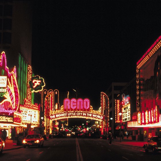
Reno, Nevada
Anyway, the boundaries between what is tacky, exaggerated, garish, distasteful and what is aesthetic or simply beautiful or stylish are difused in the use of neon light. The example of bad taste would be Las Vegas and Reno, Nevada. I have never been in Las Vegas, but I have been in Reno: casinos, buildings with great illuminations, neon and bright bulbs and lights everywhere and the result is tacky, ugly and gaudy, I feel dizzy, nothing to do with the impressive publicity signs or the dared works of the conceptual artists. I agree with what the journalist and writer Tom Wolfe has written: “Neon became associated early in the game with bars. The skyline of Las Vegas or Reno at night is not made of buildings or trees it is all signs (…) The sign company people have no aesthetic sense. This is both good and bad. It’s bad in that it doesn’t create any sense of artistry in the people working in the field. The good side is that it creates an ahistorical atmosphere.”
Architecturally neon offers many graphic and environmental applications in a field that often relegates light to an element of secondary importance. It will increase the architect possibilities but in Reno (I suppose in Las Vegas too) cannot be considered an example of how neon and architecture work together. According to Rudi Stern, signage and ornamentation as used in Las Vegas or Tokyo become a part of conscious architectural statement: “Yet is too narrow a perspective for architects to think of neon only as a signage or, for that matter, only as façade ornamentation. Unfortunately for many architects, neon is the last shoddy pink “pizza” sign they have seen, and they summarily reject a medium that offers great promise as a spatial and environmental element. Most architects have never considered what the medium can do for them”. He is right, neon light is sometimes used in historical buildings or skyscrapers only to reinforce some architectural lines or to make them appear to be taller than they are. Neon in architecture has to be an integral part of the building, an integration of form and light and maybe have kinetic properties of light. Sometimes this happens, when neon as a fluid electric line is capable of creating an defining space in new ways.

Helmut Jahn. Liberty Tower. Philadelphia.
To give an example that I know: the Liberty Tower in Philadelphia lighting tubs emphasizes the triangular shapes of the dome and the colors are often changing. Expresses a rhythm for which the steel seems the scaffolding, gives dynamism to the building while distinguishing and animating the skyline of the city. Neon become an active design element.

Henry Hosauser. The Webster (1939). South Miami Beach
Or the use of neon on the small buildings and hotels of the Miami Art Deco District, in South Miami Beach, is wonderful, very good taste. Simple lines emphasizing the architectural volumes that distinguish Art Deco forms and the signs with the name of the hotel or store. As an expression of American Art Deco, neon light had here the opportunity to escape from signage and be a creative medium in its own right.

Michael Hayden. The Sky’s The Limit (1987). O’Hare International Chicago Airport
One of the best examples I know of neon light as part of the architectural conception is the walkway of the United Airlines terminal in the O’Hare International Chicago Airport made by the Canadian neon artist Michael Hayden (1946). He create a great environment effect. It’s like a wonderful rainbow neon artwork named The Sky’s The Limit (1987). The colors are changing and the moving neon at the tunnel, as a light sculpture dancing, is completed with electronic music, and glowing wall panels; it is exciting to walk through, you feel that you are in a psychicodelic tunnel. Actually is not composed by neon gas, but argon gas and mercury vapor in phosphorescent glass tubes that were then painted with an enamel ink. It is allegedly the longest neon sculpture in the world. It was listed as one of the 150 favorite structures in the United States by the American Institute of Architects.
Neon light and Conceptual Art
Ron Pompeii, an sculptor designer that has been doing many store design projects in Philadelphia said: “Neon light writing expands the imagination of places and images which would otherwise remain invisible. Signs are always in the public domain. They exist on the street. Art sometimes remains dormant in a museum, removed from everyday society.” Anyway, pieces of illumination translating into a sculptural entity or installations are on display at the museum’s contemporary sections. Some of the most important conceptual artists of the last century and active in the current have worked the neon: among others, Lucio Fontana, Mario Mertz, Joseph Kossuth, Tracey Emin, Piotr Kowalski, and above all Bruce Nauman. (Dan Flavin have make objects and installations from commercially available fluorescent light fixtures but a few neon works).
Lucio Fontana (Rosario, Argentina, 1899-1968)
Italian-Argentinian artist Lucio Fontana paved the way to neon light in contemporary art with his installation Spatial Light – Structure in Neon for the 9th Milan Triennial at the Palazzo dell’Arte in 1951.

Spatial Light – Structure in Neon for the 9th Milan Triennial at the Palazzo dell’Arte in 1951
This aerial sculpture was suspended from the ceiling of the central staircase of the Palazzo dell’Arte. The 100-metre-long loop of neon tubing extended across the whole of the ceiling – a continuous sign of intersecting curves of light. He saw as overcoming the divisions in architecture, painting and sculpture to reach a synthesis in which color, movement and space converged. Critics at the time described it variously as a lasso, an arabesque and a piece of spaghetti, but Fontana disliked this simplistic interpretation: “[It] is not a lasso, an arabesque, nor a piece of spaghetti… it is the beginning of a new expression a spatial environment; in collaboration with the architects Baldessari and Grisotti we have substituted for the decorated ceiling a new element which has entered into the aesthetic of the man on the street, neon, with this means we have created a fantastical new decoration.” In fact, Spatial Light was reconstructed inside the Museo del Novecento of Milan. Fontana already uttered prophetic words in 1949: “There can be no evolution in art that still uses stone and color, it will be possible to make a new art with light, neon, television, projection.”
Lucio Fontana. Ambiente spaziale con neon (1967/2017) HangarBicocca, Milan
The HangarBicocca, an art gallery based in Milan, brings back to life the big temporary light installations created by Lucio Fontana, closely connected in their design to the architecture that hosted them. Visitors can walk through nine environments and two interventions designed by the artist between 1949 and 1968 using neon tubes, ultra-violet lights, and optical tricks. Rooms and corridors that the artist began to conceive and design in the late 1940s, were almost always destroyed once the exhibition was over; they are Fontana’s most experimental yet least-known works, due to their ephemeral nature. Some of the environments on view have been reconstructed for the first time since the artist’s death. I have not seen this exhibition, so for more information go to: http://www.hangarbicocca.org/en/exhibition/lucio-fontana-environments/

Lucio Fontana
Fontana was born in 1899 in Rosario, Argentina. His father, Luigi, was an architect and sculptor from Varese, Italy who emigrated to South America in 1891, opening a studio specialized in architectural decorations, while his mother, Lucia, was an Italian-born actress. In 1905, Luigi Fontana returned to Italy with Lucio. After fighting in World War I, Lucio Fontana moved to Argentina in 1922. In this period, he made many public sculptures and decorative works. In 1927, he came back to Milan and enrolled at the Brera Academy. He lived and worked in Italy until 1940, but moved back to Argentina again when World War II broke out. Here he came into contact with a number of young artists with whom he developed the theories and concepts that coalesced as the Manifiesto Blanco, published in 1946. The following year, Lucio Fontana moved back to Italy, where he remained until his death in 1968. He was always interested in the relationship between space and the viewer, this the reason why he kept up close ties to the world of architecture throughout his career. He collaborated with some of the most important Italian architects of the time, including Gio Ponti, Carlo Scarpa o Vittorio Gregotti.
I want to share what the HangarBicoca homepage say about the artist: “Fontana was one of the most influential Italian artists of the mid-twentieth century. Fontana dedicated his entire career to investigating the concepts of space, light, the void and the cosmos. His work radically transformed our conception of painting, sculpture, and space by transcending the two-dimensionality of the canvas, and foreshadowed many movements of the 1960s and 1970s, like Arte Povera, Conceptualism, Land Art and Environmental Art. As the founder of Spatialism, an artistic movement that emerged in Italy in the late 1940s, Fontana notably did away with the distinction between painting and sculpture, with his famous slashes and holes in the canvas.” If somebody is interested, the exhibition will run until the end of February 2018. Fontana open the way for subsequent artists to use neon. His works are so innovative even today.
Bruce Nauman (Fort Wayne, Indiana, 1941)
Bruce Nauman worked on neon sculptures and light-room installations between the 1960’s and 1990’s. Nauman was fascinated by neon’s use as an advertising medium, and its potential as a vehicle for social commentary in an art context. The neon advertising signs on the streets around his studio in San Francisco prompted him to work with neon light in 1966.
He recalls the early neon signs that he hung in his street-level studio window: “I had an idea that I could make art that would kind of disappear—an art that was supposed to not quite look like art. In that case, you wouldn’t really notice it until you paid attention. Then, when you read it, you would have to think about it.” Between 1966 and 1968, in particular, he experimented with spatial boundaries, and neon light’s elusive edges and aural glow allowed him to explore the viewer’s interaction with lighted space.
Bruce Nauman. My Name As Though It Were Written on the Surface of Moon (1968). Stedelijk Museum, Amsterdam
He focused on the subject of identity, language, signs, and symbols. He created several neon sculptures that combined word play and bold color to give alternative meaning to everyday phrases and expressions. For example My Name As Though It Were Written on the Surface of Moon (1968) addresses name in relation to identity while at the same time challenging the value placed on an artist’s signature.

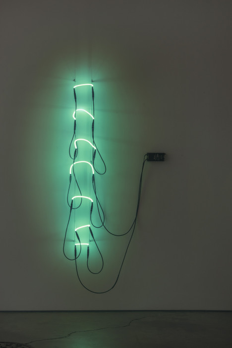
Bruce Nauman. La Brea/Art Tips/Rat Spit/Tar Pits (1972). Tate Modern, London
His use of light as a medium is both sensual and contemplative, while messages and images change everything and create destabilizing environments. Light offered the artist a medium with which to explore how perception is shaped, and logic and meaning is conveyed. In Nauman’s hands, the playful carnival-like nature of neon is transformed into psychological, social, sexual and political inquiry, often presented with irony and humor. For example La Brea/Art Tips/Rat Spit/Tar Pits (1972), Violins Violence Silence (1982) or Double Poke in the Eye II (1985). All demonstrate Nauman’s witty and insightful exploration of the human condition with his word games or figures.

Neon’s potential allows him to confront and offer sharp comments in pieces in such pieces as and Run From Fear, Fun from Rear (1972) or the monumental One Hundred Live and Die (1984), his largest and most complex neon piece that overwhelms the viewer with strong sentences.

Bruce Nauman One Hundred Live and Die (1984). Naoshima Contemporary Art Museum, Kagawa, Japan
He likes to play with opposites and contradictions that don’t leave anyone indifferent like the one on display at the Carnegie Museum of Art in Pittsburgh: Having Fun/Good Life, Symptoms (picture at the end of the post), our attention is captured with its whirling neon inviting us to grapple with a list of words and their antonyms.

The True Artist Helps the World by Revealing Mystic Truths (1967) it is considered his master piece. This early work consists of the titular sentence written in light blue neon lights twisted into a spiral so that the beginning of the sentence is in the middle of the spiral. A bright red neon line reinforces the spiral; it begins beneath the sentence but because of the spiral form of the piece, the line ends above the sentence. Thus, a single line appears both above and below the statement. Whether intended or not, the positioning of the spiral causes it to resemble the number 6; the number 6 it is considered the first perfect number (1+2+3=6). This number has long been associated with perfection itself, wholeness, and aesthetic pleasure. The sentence is simultaneously assertive and ironic, true and false, hopeful and tendentious. The garish neon light and the immediately recognizable design recall advertisements like “open” signs in the shops doors entrance or in liquor stores windows. Indeed, shortly after its completion, Nauman hung this work in the window of his studio (converted from a grocery store). Like so many advertisements, this one draws the viewer in—its spiral shape compels us to twist our necks and turn our heads to follow the script even though such an exercise is wholly unnecessary since the message is so short. The true artist helps the world by revealing mystic truths is not an aesthetically pleasing work nor is it aesthetically displeasing. The materials, of course, contribute to its effect but they are hardly intrinsic to that effect in the way that paint is intrinsic to a painting. It is, of course, not a painting but it is not really a sculpture, either. It is a piece that uses words but it is not literary. It is merely there—on the wall, in a window, on your computer screen or in your mind. We may choose to interact with it or we may choose to pass it by.
Bruce Nauman. Neon Templates of the Left Half of My Body Taken at Ten-Inch Intervals (1966). Philip Johnson Glass House Collection
I’ve been following Nauman whenever I could. My first contact with his neon work was in 1994 at the Museo Reina Sofía, in Madrid at his show Inside outside, with a work that caught my attention, for being neon, of course, and something more.Neon Templates of the Left Half of My Body Taken at Ten-Inch Intervals (1966) which grew out of a performance work, is an innovative exercise in portraiture as sculpture. Is one of his early light woks grappled with the semiotics of body and identity.

Later I saw him in several museums and with my husband to be at the 2009 Venice Biennale in our first trip to the city. Nauman represented the United States and winning the Golden Lion award with the installation Days and Giorni. The works on display inside of the pavilion of his country were not made of neon, but on the outside he hung words of protest. Anger was hung on the entablature of the classic shape temple of the United States pavilion.
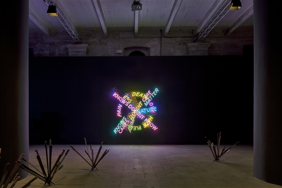
Bruce Nauman. Life, Death, Love, Hate, Pleasure, Pain (1983). With Adel Abdessemed’s Nympheas (2015). Venice Biennale, 2015
Six years later, we saw him again at the 2015 Venice Biennale, in the Arsenale, chosen by Nigerian curator Okwui Enwezor for All the World’s Futures event with a shockingly installation. We step into a dark room where Algerian artist Adel Abdessemed planted several clusters of knives and blades scattered across the floor like so many deadly bouquets. The blades and knives received the flashes of the Bruce Nauman neon texts with words like war, raw, eat, death, stick in your ear, sit on my face, rub it on your chest…

Also, Nauman is the guest artist at the event Tate’s Artist rooms which runs until July 2018. The show spans the artist’s career with neon, video works, sculpture and works on paper. According to the Tate, Nauman “is widely regarded as one of the most innovative and influential American artists working today. Since the 1960s, his pioneering exploration of different media, in often funny, absurd or disturbing ways, has challenged conventions and had a profound impact on generations of artists internationally.”

Bruce Nauman
Bruce Nauman was born in 1941, in Fort Wayne, Indiana. His father, an engineer and a salesman, moved the family several times to different midwestern locations, resulting in a somewhat turbulent and lonely childhood for Nauman. A shy and small youth, Nauman enjoyed reading, and studied piano, guitar, and upright bass. Although he was not encouraged by his parents to continue his musical pursuits, he played in a polka band during his high school years in Wauwatosa, a suburb of Milwaukee, and continued to play in bands in college, first a dance band and then in jazz groups. He received no training and very little exposure to visual art during his childhood and did not develop a true passion for creating art until college. Nauman began his education at the University of Wisconsin where he first concentrated on math and physics, but after his sophomore year he informed his parents that he would become an artist and graduated in 1964 with a bachelor’s degree in science with a minor in painting. Upon his graduation, he moved to a studio in San Francisco and taught at the Art Institute, seldom encountering his colleagues and peers. This solitary lifestyle contributed to the development of a method of working in seclusion that would persist for several years.
Later, he decided to give up painting, claiming that the materials “got in the way.” This break with painting spurred an exploration of different kind of media, and in subsequent years, Nauman became prolific in film, performance and sculpture. Although he had his first solo show in 1968 at the Leo Castelli Gallery in New York, he was initially rejected by many American critics for the anti-formal nature of his work, European art critics were in the way of informal and conceptual artists like Joseph Beuys and the Italian Arte Povera group, so they embraced Nauman’s work, particularly his alternative media and it was exhibited in various European art centers.

In the mid-1970s, he began to employ more text in his works, channeling his anger and frustration into phrases that were featured in the compositions, trying to find a cohesive way of incorporating his voice into his commanding structures, his work evolved in a more conceptual direction. Neal Benezra, director of the San Francisco Museum of Modern thinks that “Gestaltism is the first major influence that stands out in Nauman’s work, which is derived from his interest in phenomenology and behaviourism and which he applies to his indignation of human behaviour regarding unpleasant or distressing situations. Other influences evident in this artist’s work are found coming from the philosopher Ludwig Wittgenstein, because of his critique of the validity of language, its meaning and its representation, the writer Elias Canetti, because of his study on the behaviour of the masses and also writer Samuel Beckett, because his bleak idea of man’s destiny.”
Nauman finally has found a home in New Mexico. In 1989, he established his home studio in Galisteo, the place where he works and lives to this day accompanied by his wife, the painter Susan Rothenberg. Nauman remains one of the most influential contemporary American artists. His innovative and provocative ideas are expressed in a wide range of media and materials, which makes it difficult to categorize his work as inhabiting a single style.
Chryssa, Athens, 1933-2013

Chryssa. Ampersand III (1965). Indianapolis Museum of Art
At the Indianapolis Museum of Art, is on display the work Ampersand III by Chryssa Vardea-Mavromichali, so called- Chryssa, an artist who uses neon light, that remains me some Bruce Nauman pieces. The label gallery describes it: “Here, colorful neon tubing is shaped into an ampersand symbol (&) that is repeated five times. The use of Plexiglas produces a mirroring effect due to its reflective surface. The glowing ampersand evokes the urban environment and its myriad advertising, but loses meaning through fragmentation and lack of context.”

Chryssa. Study for Gates N. 4 (1967). Tate Gallery. London
Chryssa, is a Greek-born American sculptor that in the 1960s was one of the first artist to transform neon lighting from an advertising vehicle into a fine art medium, even before than Bruce Nauman. About the exhibition of Chryssa’s neon sculptures at the Pace Gallery in Manhattan in 1968, The New York Times called one work, Study for the Gates No. 15 like “a pure, lyrical form. It transcends ‘neon-ness’ to become a sculpture of light devoid of pop or Broadway associations.” She created sixteen sculptures about the “gates” before and after the completion of The Gates to Times Square, her most ambitious work, an homage to the Greek-born artist’s experience of New York.

Chryssa. The Gates to Times Square. (1966). Collection Albright-Knox Art Gallery, Buffalo
In 1966, Chryssa completed The Gates to Times Square a brightly lighted sculpture. Built of cast stainless steel, plexiglass and neon tubing, it takes the form of an immense cube, 10 feet on each side, through which visitors can walk. Inside, after passing through an entrance in the form of a large capital A, visitors are met with a counterpoint of symbols, text and colors.
New York, where Chryssa first lived in the mid-1950s, furnished the literal spark for her work. She had long been fascinated with written communication and her early work, focused on writing — in particular on fragmentary bits of text — as a medium of art. She realized that neon tubing could provide the link of text, color and illumination she craved. She said: “I saw Times Square with its light and letters and I realized it was as beautiful and difficult to do as Japanese calligraphy.” She began incorporating neon into her work in the early ’60s and over time surmounted the fiendish technical difficulties the medium entailed.

Chryssa
Chryssa Vardea-Mavromichali was born in Athens in 1933. She grew up amid the Nazi occupation of Greece, a time when members of the Greek underground communicated with one another by writing furtive messages on the walls of buildings. It is said that this was the wellspring of her obsession with fragmentary text. Chryssa began her professional life as a social worker, assisting earthquake victims on the Greek island of Zakynthos. Growing disillusioned with what she saw as government intransigence, she left for Paris, where she studied art at the Académie de la Grande Chaumière and came under the influence of Surrealists like the poet André Breton and the artist Max Ernst. Moving to the United States, she attended the San Francisco Art Institute before settling in New York. Chryssa, who became an American citizen, moved back to Athens in the early 1990s but later returned to New York. Chryssa, whose work has been classified as Minimalism and Pop, is considered a significant presence on the American art scene in the ’60s and ’70s.
Joseph Kossuth (Toledo, Ohio, 1945)

Joseph Kossuth. The Language of the Equilibrium (2007) Isola di San Lazzaro degli Armeni. Venice Biennale, 2007
The spectacular and outstanding installation The Language of the Equilibrium on the Island of San Lazzaro degli Armeni at 2007 Venice Biennale is my first contact with the work of Joseph Kossuth. It seems to me so significant that it is worth mentioning this artist as one of those who has used the neon with the result of a great artistic quality. I visited the island for the first time in July 1997. San Lazzaro could only be accessed by vaporetto one day a week to see the monastery only in four hours. The day I went, we were only visiting the island three people and an Armenian monk was our guide. The island of San Lazzaro is the headquarters of the Mekhitarian Order, founded in Constantinople, since in 1717. The order understood the implicit potential of the written word for the preservation of Armenian culture threatened by the vicissitudes of history; the Armenian people are among those who have suffered persecution and genocide. The monastery keeps a rich library, consisting of over 140,000 volumes such as the first complete dictionary of the Armenian language (1749–69), the first modern history of Armenia (1781-86) and the first translation of the Bible into Armenian. All it was made in the island by the monks which made it an early major center of Armenian printing. The library also custody 4,500 precious manuscripts, including many illuminated works by Armenian miniaturists and by the Greek and Syrian holy fathers. Now the monastery is open to the public every day, receives tourism and is the pavilion of the Republic of Armenia at the Venice Biennale. I visited the island again with my husband in 2015 and I celebrated that Armenia won the Golden Lion for the magnificent exhibition Contemporary Artists from the Armenia Diaspora with the artists works on display in the whole monastery and gardens.

Joseph Kossuth. The Language of the Equilibrium (2007) Isola di San Lazzaro degli Armeni. Venice Biennale 2007
Back to the The Language of the Equilibrium, Kossuth has intervened on different parts. So, long text written in yellow neon surrounded the church, the cornice of the bell-tower and the wall that marks the boundary between land and lagoon, and conveys the inexhaustible vital force of this element. He described the installation as follows: “This project, in yellow neon, has as its basis language itself. It is a work which is both a reflection on its own construction as well as on the history and culture of its location.” Language here is used as a symbol of the Mekhitarian order history but words, written in Armenian, Italian and English language, were related with water and the relationship between this key primary element and the intellectual and linguistic concepts associated.

Joseph Kossuth. Joseph Kossuth. The Language of the Equilibrium (2007) Isola di San Lazzaro degli Armeni. Venice. Biennale 2007
According to curator Adelina von Fürstenberg, yellow neon is chosen because of the symbolic understanding of yellow at the time of the founding of the monastery as meaning ‘virtue, intellect, esteem and majesty.” Its like if the words have been written in gold. According to hermeneutic and art critic Juan Eduardo Cirlot, gold is the image of solar light and hence of the divine intelligence and supreme illumination; gold is also the essential element in the symbolism of the hidden or elusive treasure. Armenia had no country, it had to hide its culture, its language, its art, for long time. It were preserved in San Lazzaro.

Joseph Kossuth. Five words in Green Neon (1966). Whitney Museum of American Art. New York
Also, Kossuth uses neon and writing in his works for the re-reading of salient passages from philosophy and modern and contemporary literature. In an earlier work Five Words in Green Neon (1965), on display at the Whitney Museum of American Art in New York, he was inspired by Wittgenstein’s tautologies. Here, the meaning of the phrase is equated with how the words are visualized. Kossuth plays with linguistic and verbal literalness by giving us a visual equivalent in the neon letters to what the text reads regardless of its form. In this case, they are shown with green neon tubes shaped to form the words of the phrase. Five Words in Green Neon is not only the title of the object, but all that we see. Art, Kossuth suggests, does not reside in the object itself, but in our ideas about the object. Pure conceptual art.

Joseph Kossuth
Joseph Kossuth attended the Toledo Museum School of Design and the Cleveland Institute of Art on a scholarship. Then, he spent a year in Paris and traveled throughout Europe and North Africa. He moved to New York in 1965 and attended the School Visual of Art and he studied anthropology and philosophy at the New York School for Social Research. He was an art teacher in American and European centers. Through his art and writing he emphasized his interest in the dialectical process of idea formation in relation to language and context. He introduced the notion that art, “was not a question of forms and colors but one of the production of meaning.” He became acknowledged as one of the pioneers of Conceptual art and installation art.
Mario Mertz (Milan, Italy), 19225-2003
Merz began using neon in 1966, first in relation to painting – which comprised a series of blank canvases pierced with thin neon tubes- before moving onto sculpture. Mario Merz not only used neon tubes to pierce his paintings and his igloos, but also to trace out quick poetic lines and the Fibonacci sequence of numbers, which reveals the mathematic progression of nature adding on to itself (seen in the distribution of leaves, branches, the spirals of snail shells, etc). Mertz transferred this symbol of infinity to buildings.

Fibonacci Sequence (1994) Energy Power Plant, Turku, Finland
In 1970 Merz began to utilize the Fibonacci formula of mathematical progression within his works, transmitting the concept visually through the use of the numbers, which progress by adding the previous two in the sequence together, underline architecture’s aspiration to infinity, as a metaphor of thought and human action.
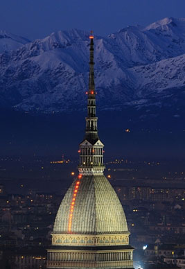
Mario Mertz. The Flight of Numbers (2000). Dome of the Mole Antonelliana, Turin (Italy)
Particularly moving are the permanent installations: The Flight of Numbers (2000) on the dome of the Mole Antonelliana, the highest monument in the city, where Mertz put a landmark that has a considerable presence in the city since you see it from far away at night; or Fibonacci Sequence (1994) on the chimney of the Energy Power Plant in Turku (Finland).

Mario Mertz. che fare? (1968-73). Tate Modern, London
The Tate Modern in London displays permanently che fare? that consists of a two-handled oblong aluminium tub filled with yellow beeswax, on top of which is a light blue neon sign that reads che fare? (what to do?). This question is closely associated with a 1902 speech given by Vladimir Lenin in which he used the words as a revolutionary call to arms. This polemical speech was republished in Italy in 1968 (the year that this sculpture was made) and was read and received enthusiastically. Merz began to use this phrase recurrently in his work. However, Merz has remarked: ‘For me, che fare? was to be taken literally, not in its direct political thrust … It was a question I was asking myself.”

Mario Mertz. Giap’s Igloo (1968). Centre Pompidou, Paris
In 1968 Merz adopted one of his signature motifs, the igloo, continued throughout his life, revealing the prehistoric and tribal features hidden within the present time and space. He saw the mobility of this typical shelter for nomadic wandering as an ideal metaphor for the space of the artist. It was constructed with a metal skeleton and covered with fragments of clay, wax, sandbags, mud, glass, burlap, bundles of branches, and often political or literary phrases in neon tubing. The neon words on his igloos have the power of being more than catch phrases or slogans, but the voice of his time in history.
His first of the dome/igloo-shaped structures, the known Giap’s Igloo (1968), was surrounded with a saying by General and politician Vo Nguyen Giap of North Vietnam: If the enemy masses his forces, he loses ground. If he scatters, he loses force. In contrast to these humble materials, the neon lettering adds a streak of energy. This use of humble, everyday materials in sculpture is typical of arte povera (‘poor art’), an Italian art movement, defined by the Italian critic Germano Celant in 1967, of which Mario Merz was a member.

Mario Mertz
Mario Mertz was born in Milan. He grew up in Turin and attended medical school for two years at the Università degli Studi di Torino. During World War II he joined the anti-Fascist group Giustizia e Libertà and was arrested in 1945 and confined to jail, where he drew incessantly on whatever material he could find. In 1950 he began to paint with oil on canvas. His first solo exhibition, held in Turin, in 1954, included paintings whose organic imagery Mertz considered representative of ecological systems. He explored the relationship between nature and the subject. By 1966 he began to pierce canvases and objects, such as bottles, umbrellas, and raincoats with neon tubes, altering the materials by symbolically infusing them with energy. He worked in Turin in the intellectually context of Turin in the 1950s, a cultural climate fed by such writers as Cesare Pavese or Ezra Pound.
Merz became fascinated by architecture: he admired the skyscraper-builders of New York; his father was an architect; and his art thereby conveys a sensitivity for the unity of space and the human residing therein. He was intrigued by the powerful (Wagner, D’Annunzio) as well as the small (a seed that will generate a tree or the shape of a leaf) and applied both to his drawing and igloos.
Piotr Kowalski (Liviv, 1927, Poland, [now Ukraine]- Paris, 2004)
Piotr Kowalski was an sculptor, a mathematician and an architect. He worked in non-traditional materials including electronic and mechanical devices, neon art, large earth works, explosions and other natural phenomena including plant growth and gravity. His work often expressed science or natural laws in direct and tangible ways, immediate to the senses.

Piotr Kowalski. Idenité n. 2 (1973). Centre Georges Pompidou, Paris
His best known work is Identité n°2, one of a group of six pieces, is thus composed of three red neon cubes of different sizes mounted on steel bases, together with three mirrors that differ in their reflection of the size of the cubes. The Centre Georges Pompidou of Paris, where this piece is on display points out: “The distances between all the elements are however calculated in such a way that at a specific point the viewer sees reflections of identical size in all three mirrors. Evoking the relation between art and science, and between internal image and worldly technology, Identité n°2 leads viewers to reflect on their perception of reality and in consequence on their own identity.”

Piotr Kowalski in his studio
Kowalski was born in Poland. A refugee of World War II living in Brasil. He moved to the United States and he attended Massachusetts Institute of Technology from 1947 to 1952, receiving a Bachelor in Architecture, and maintained relations with MIT throughout his life as fellow at the Center for Advanced Visual Studies. He worked as an architect for I. M. Pei, then joined Marcel Breuer as an architect at UNESCO in Paris. He moved to France and became a visual artist but did not abandon the sciences that will be at the center of his work: he will manipulate light and magnetic energy, and much later the holograms or the Internet. In 1985, he became president of the Ars Technica Association connected to the Cité des Sciences et de l’Industrie uniting philosophers, artists, scientists reflecting on the relationship between art and new technologies. He was named professor at École nationale supérieure des Beaux-Arts de Paris in 1987.
Tracey Emin, London (1963)
Tracey Emin was born when the aforementioned artists began to work the neon. She’s an artist known for her autobiographical and confessional artwork. Emin produces work in a variety of media including drawing, painting, sculpture, film, photography, installations, neon and sewn appliqué. Emin reveals her hopes, humiliations, failures and successes in candid and, at times, excoriating work that is frequently both tragic and humorous. Her work has an immediacy and often sexually provocative attitude that firmly locates her oeuvre within the tradition of feminist discourse.

Tracey Emin. Is Anal Sex Legal (1998). Tate Modern. London
His art has been described as obscene, profane and painful and have been analysed within the context of early adolescent and childhood abuse, as well as sexual assault, because she suffered an unreported rape at the age of 13 that changed her life forever. Emin’s story is well known by the media. Until she was seven, she lived in a Margate (Kent) hotel owned by her Turkish-Cypriot father, who kept another family elsewhere. But then he went bust and she and her mother, Pam, and her twin brother, Paul, found themselves down on their luck. Tracey and Paul were left in the care of their grandmother while Pam was away working, and by the time they were teenagers they were wild. He was into drugs; she was into drink and sex.

Tracey Emin. The Scream (2013). Tracey Emin Studio
In 1987 Emin moved to London to study at the Royal College of Art. After graduation in painting, she had two traumatic abortions and those experiences led her to destroy all the art she had produced in graduate school and later described the period as “emotional suicide. Her influences included Edvard Munch and Egon Schiele, as for example in his work The Scream, that remind us the Munch’s work. She was the “enfant terrible” of the Young British Artist in the 1990/2000’s; like many of them she has been a fortunate recipient of the patronage of Charles Saatchi. Now she is a famous artist supported by rock and roll celebrities. She has spoken of “the narcissism behind what I do—the self, self, self—and how difficult it is for me to really share things, even though I think I am sharing all the time.”
 Tracey Emin. The Last Great Adventure is you (2013). Studio Tracey Emin
Her creating process often begins with coming up with a message, usually a thought or a feeling and then transferred to neon light tubes. Many artists that have used neon lights prefer to use molded letters and neutral writing, Tracey Emin stands out because she uses her own handwriting. Is a way to stamp her personality and individuality in all pieces created. She uses simple every day phrases to provoke emotions or shocks in the audience, for example one of her best known works You Forgot To Kiss My Soul (2001) which consists of those words in blue neon inside a neon heart-shape, pieces that sometimes are corny, but by expressing her own emotions, thoughts, and aspirations, it is considered that she connects to the soul of the observers.

Tracey Emin. You Forgot To Kiss My Soul (2001). (There are several versions)
She was chosen to produce a show of new and past works for the British Pavilion at the 2007 Venice Biennale. She exhibited a wide variety of media – from needlework, photography and video to drawing, painting, sculpture and… neon light. She introduced the purple series Legs that was directly inspired by her 2004 watercolor Purple Virgin series.


Tracey Emin at the Venice Biennale 2007
Emin has donated a neon work to auction for charity held in London in 2007. Her neon Keep Me Safe reached the highest price ever made for one of her neon works of over £60,000. The money raised helped provide care and support to people living with and affected by HIV.

Tracey Emin. Keep me Safe
Nam June Paik (Seoul, 1932-2006)
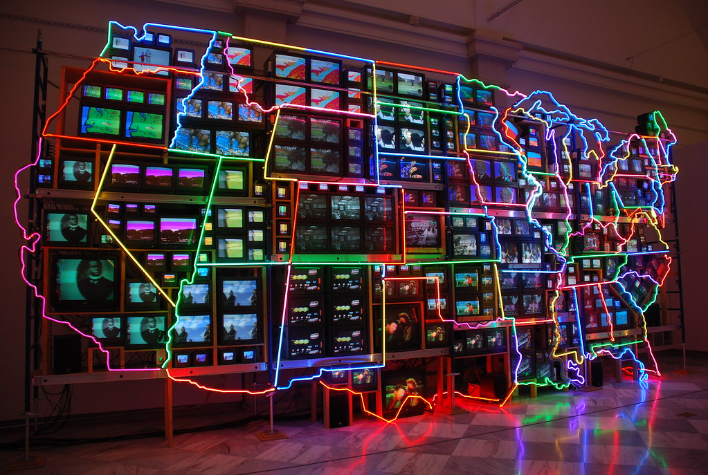
I want to finish this post with one of the best, maybe the best conceptual artist of the last century who introduced too neon light: the Korean American Nam June Paik. Neon, let’s remember that where it has developed the most has been in the United States, deserved this masterpiece by Nam June Paik on display at the Smithsonian’s American Art Museum: Electronic Superhighway: Continental U.S., Alaska, Hawaii (1995). The huge piece consists of fifty-one channel video installation (including one closed-circuit television feed), custom electronics, neon lighting, steel and wood color, sound. It has been a gift to the museum by the artist.

Nam June Paik. Electronic Superhighway: Continental U.S., Alaska, Hawaii (1995). Smithsonian’s American Art Museum. Washington DC
In 2009, the Smithsonian’s American Art Museum became the home for Paik’s archives. If you want to study Paik you have to stop in this great museum based in Washington DC. According to the museum, the Nam June Paik Archive “consists of research material, documentation, correspondence, sculptural robots, and video and television technology. It provides unprecedented insight into Paik’s creative process, his sources of inspiration, and the communities of artists on three continents with whom he worked for more than five decades beginning in the 1950s. The collective archive also includes thousands of individual items.“
Nam June Paik. Electronic Superhighway: Continental U.S., Alaska, Hawaii (1995). Smithsonian’s American Art Museum. Washington DC
Back to Electronic Superhighway: Continental U.S., Alaska, Hawaii, it has become an icon of America in the information age. You can read in the gallery label: “When Nam June Paik came to the United States in 1964, the interstate highway system was only nine years old, and superhighways offered everyone the freedom to “see the U.S.A. in your Chevrolet.” Walking along the entire length of this installation suggests the enormous scale of the nation that confronted the young Korean artist when he arrived”. So, neon tubes outlines the monitors, the states borders, recalling the multicolored maps and glowing enticements of motels and restaurants that beckoned Americans to the open road. The different colors remind us that individual states still have distinct identities and cultures, even in today’s information age. Paik augmented the flashing images “seen as though from a passing car” with audio clips from The Wizard of Oz, Oklahoma, and other screen gems, “suggesting that our picture of America has always been influenced by film and television.” Paik was the first to use the phrase “electronic superhighway,” and this installation proposes that electronic media provide us with what we used to leave home to discover the world. But Electronic Superhighway… is real: “It is an enormous physical object that occupies a middle ground between the virtual reality of the media and the sprawling country beyond our doors.“
Dr. Tina Rivers Ryan is an art historian educated in Harvard and Columbia universities and curator specializing in art from the 1960s to the present day, with a focus on the uses of new media technologies, knows well Paik and his works. She explains that in 1974, he submitted a report to the Art Program of the Rockefeller Foundation, one of the first organizations to support artists working with new media, including television and video. Entitled “Media Planning for the Post Industrial Society”, the report argued that media technologies would become increasingly prevalent in American society, and should be used to address pressing social problems, such as racial segregation, the modernization of the economy, and environmental pollution. Presciently, Paik’s report forecasted the emergence of what he called a “broadband communication network”—or “electronic super highway”—comprising not only television and video, but also “audio cassettes, telex, data pooling, continental satellites, micro-fiches, private microwaves and eventually, fiber optics on laser frequencies. By the 1990s, Paik’s concept of an information “superhighway” had become associated with a new “world wide web” of electronic communication then emerging—just as he had predicted.
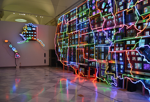
Tina Rivers Ryan points out that on Electronic highways… “the states are firmly defined, but also linked, by the network of neon lights, which echoes the network of interstate “superhighways” that economically and culturally unified the continental U.S. in the 1950s. However, whereas the highways facilitated the transportation of people and goods from coast to coast, the neon lights suggest that what unifies us now is not so much transportation, but electronic communication. Thanks to the screens of televisions and of the home computers that became popular in the 1990s, as well as the cables of the internet (which transmit information as light), most of us can access the same information at anytime and from any place.” Today that seems normal to us but not at the end of the last century, Paik was a pioneer in his recognition of television and video as artistic tools and above all he envisioned the cybernetic future.
While Paik’s work is generally described as celebrating the fact that the “electronic superhighway” allows us to communicate with and understand each other across traditional boundaries, this particular work also can be read as posing some difficult questions about how that technology is impacting culture: The physical scale of that work and number of simultaneous clips makes it difficult to absorb any details, resulting in what we now call “information overload,” and the visual tension between the static brightness of the neon and the dynamic brightness of the screens points to a similar tension between national and local frames of reference.

Nam June Paik in 1981
So, Nam June Paik is one of the most influential artists of his generation, who transformed television and video into artists media. It is considered the father of the video art and performance media. He was born in Seoul, his father owned a major textile manufacturing firm. As he was growing up, he was trained as a classical pianist. In 1950, Paik and his family had to flee from their home in Korea during the Korean War. His family first fled to Hong-Kong, but later moved to Japan. He graduated from the University of Tokyo where he wrote a thesis on the composer Arnold Schoenberg. Later he moved to Munich to study music history with composer Thrasybulos Georgiades. While studying in Germany, Paik met the composers John Cage and the conceptual artists George Maciunas, Joseph Beuys and Wolf Vostell and became from 1962 on, a key participant in the international Fluxus movement, which stressed liberation from traditional artistic categories, with an emphasis on performance.
Paik moved to New York in 1964 and married the video artist Shigeko Kubota and became American citizen. He was a lifelong Buddhist who never smoked or drank alcoholic beverages, and never drove a car. In 1996, Paik had a stroke, which paralyzed his left side. He used a wheelchair the last decade of his life, though he was able to walk with assistance. He died in Miami in 2006.
If someone wants to expand information about art or neon signs I found a museum dedicated to the medium: The Museum of Neon Art (MONA), based in Glendale, in Los Angeles county, California. I do not know it and I’m looking forward to visit the MONA enormously; at the moment I only can share what I read in the home page: “The Museum of Neon Art encourages learning, curiosity and expression through the preservation, collection and interpretation of neon, electric and kinetic art. Neon is a gateway between scientific principles and artistic expression. Neon illumination integrates electrical technology, creative design, and fundamental concepts of physics and chemistry. The Museum of Neon Art is the only museum in the world devoted exclusively to art in electric media, exhibiting electric and kinetic fine art, and outstanding examples of historic neon signs, for over three decades.” For more information: http://www.neonmona.org/about/

The Charles Theater. Baltimore
I devote this post to my beloved husband, José M. Naharro-Calderón, with whom I live happily in the United States. We share the curiosity and the pleasure of visiting cities and museums of art throughout the country, the last one the Carnegie Museum of Art in Pittsburgh where we enjoyed an outstanding Bruce Nauman’s work: “Having Fun/Good Life, Symptoms”. And we are surrounded in our daily life by neon lights hung in taverns and stores windows of our neighborhood, Federal Hill, in Baltimore. And, as movie lovers, the neon lights of the Landmark and Charles Theater invite us to enter and promise us everything …. I love you so much

And to my dear stepdaughter Anaïs. She borrowed me the book “Let There Be Neon”. I could not have written this post without reading it.
Àngels Ferrer i Ballester

2 thoughts on “Neon lights history and its use in advertising design, architecture and conceptual art”